So, like 450 other people, I attended VentureAtlanta last week. For a first-time event, I was impressed. Things were well-organized, they ran on time, and a lot of out-of-town VC friends showed up with checkbooks.
Wednesday was great, with investor-focused events featuring ATDC and VentureLab companies. Then there were two major presentations on Thursday by Carlos Dominguez (Cisco) and by Bernie Marcus, plus a panel discussion — but the main attractions were the presentations by 21 Atlanta startup companies. And, boy, they stunk.
Alright, I’m going to be rude here… which is why this post is here instead of my other blog.
First off, everyone was alloted six minutes, and that’s too long. At an event like this, you want to give people a taste of why your company is special, not the whole meal. Three minute pitches are enough to accomplish that (see Startup Riot). Shrink the slots, and you can either fit in more deals, or you can allow more networking time (which was scarce on Thursday).
Second, the selection criteria weren’t obvious. New companies? Nope, Vocalocity and MDdatacor have been around forever. Need money? Nope, MFG.com was explicit about “having all the money they need.” I’m still not sure how these 21 companies got on stage and 100 others got left behind.
Those two issues can be laid at the feet of the organizers. To their credit, it was the first time around for this event, and I suspect they’ll improve for 2009. But then you get to the quality of the presentations themselves, and there’s no one to blame for that except the presenting CEOs.
Look, people, it’s supposed to be difficult to organize a coherent and compelling story that you can tell in six (or three!) minutes. That’s why they pay you the big bucks. (Or the big equity, if the company doesn’t have any bucks yet.) I understand that. There are lots of resources out there to help you, ranging from free to cheap to very pricey consultants.
(In my classes, I tell entrepreneurs to buy and absorb all the books by Edward Tufte, and Guy Kawasaki, and then to scrape everything then can out of Presentation Zen. Those are my basics; there are plenty more.)
But once you’ve organized your story, putting it up on the wall should be a simple mechanical process. PowerPoint is a blunt instrument, and should be used appropriately. Almost none of the CXOs presenting last Thursday got this part right.
Typeface
Part of it is the typeface rule: 30-point minimum, dammit! I emphasize this over and over again in my classes, but Thursday is an example of why I emphasize it. Look at this sample from Snapfinger:
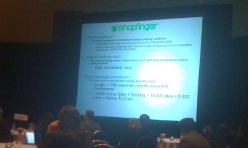
I don’t want to pick on Snapfinger—they did a decent job of explaining an interesting idea, and I wish them a lot of luck. But this photo gives an idea of why I talk about 30-point minimum fonts. From my seat, about halfway back in the ballroom, the only thing big enough to read clearly on that slide is the title. (I know, I know, it’s a lousy cellphone snapshot. But it gets my point across. If you can’t read your text in a lousy cellphone snapshot, your text is too small.)
Maybe 22-year-old founders can read it just fine. News flash: the check-writing angels and VCs in your audience are twice your age. Maybe three times. Our eyes aren’t as good as yours. Adjust.
It may be alright to cram lots of information onto a printed slide that you’re going to slide across the table to one or two people. (Actually, I have issues with that strategy also, but that’s off-topic for this post.) It’s absolutely unacceptable in a hotel ballroom with hundreds of people when you’re competing for attention with their Blackberries, iPhones, and laptops. They’ll glance up, see an illegible slide, and look back down to their email. You’ve lost them.
So, out of 21 presenters—including some very well-financed companies that have been around for years— none of them had large enough type throughout their presentation. One was only an occasional offender, and three at least seemed to try. The remainder ranged from marginal to bad to absolutely atrocious.
Better to have no slides than bad slides. And, indeed, challenging CEOs to give a presentation with zero slides would be a good test of how well they can capture and maintain attention without PowerPoint crutches. I doubt that the organizers will try this for VentureAtlanta 2009, but I wish they would!
Artistic License
Then you had the artsy syndrome… where companies had obviously paid expensive graphics artists a lot of money to draw pretty slides. Which were useless.
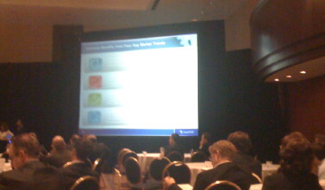
Look all the way back to the beginning of this post, to the photo of a slide presented by Bill Nussey of Silverpop. Now, I’ve been friends with Bill since he was with Greylock, and I’ve known Silverpop since it was still ActiveGrams, but for cryin’ out loud, Bill! This slide consisted of white text on gradient backgrounds that faded from pale-grey to even-paler-grey. Completely and totally illegible. There may have been good information on this slide, but it certainly didn’t survive transmogrification by the artists.
Other companies did this, too. (I’m looking at you, Paul!) It seemed the more mature and well-financed the operation, the more the slides were outsourced to artists. I’d take 30-point Arial on a black background before any of them. (And I hate Arial.)
Kitchen Sink
Finally, too many of the companies seemed convinced that they had to use their six minutes to throw in everything plus the kitchen sink. Way, way too much information. Look, a pitch at an event like this is an advertisement. You’re supposed to wind up with a call to action (shockingly few did that) to convince interested investors to come see your booth, or visit your Website, or whatever. You can’t possibly get across all the reasons he or she should invest in six minutes and a handful of slides.
Hit the high points, hit them hard, display them clearly and legibly, repeat them if you have time, and sit down. If there’s any interest, there will be lots of time to make the minor points and add clarifications later.
Overall
Out of 21 presenters, if I were assigning letter grades, I’d give:
| A | 1 |
| B | 3 |
| C | 4 |
| D | 11 |
| F | 2 |
That’s embarrassing. And sad. And unnecessary.
Starting a company is hard. Displaying a decent slide deck shouldn’t be.
If a CEO can’t get the basics right… why should I be convinced that anything
else in the company will be done right?
PS—since I know I’ll get asked, the A and B grades would have gone to SoloHealth, Multicast Media, Zenda, and MFG.com. The other grades… maybe you shouldn’t ask.