Georgia Tech’s colors are white and gold. It says so in both our fight songs (yes, we have two). Our mascot, the Rambling Wreck, is painted in white and gold. If you look on the official Communications & Marketing website, our gold is Pantone 124. We went through a few confused years when we hooked up with navy blue, but that ménage à trois was doomed to failure, and we came back to white and gold.
From the guidelines. “The official colors of the Georgia Institute of Technology are white and gold. Navy blue and black are options in order to provide contrast.”
But Georgia Tech’s colors have never, ever, included pink. Or green. Or—God forbid!—red.
So what are these atrocities in the official Georgia Tech campus store?
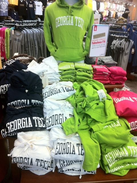
- In the photograph above, I can identify pink, green, grey, light blue, and chocolate brown in addition to white, gold, navy blue, and black.
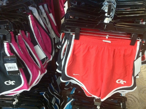
- Pink and a reddish-orange that is terrifyingly close to UGA Red.
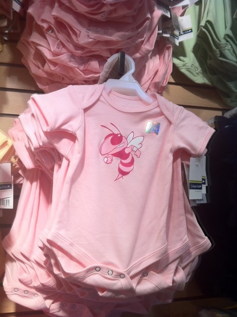
- Okay, you have a girl baby. She’s adorable. What part of “Dress her in white and gold” do you not understand?
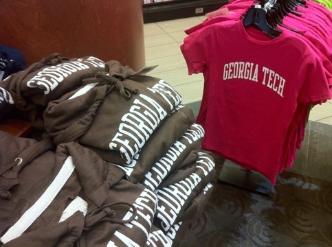
- A better view of the chocolate brown hoodies.
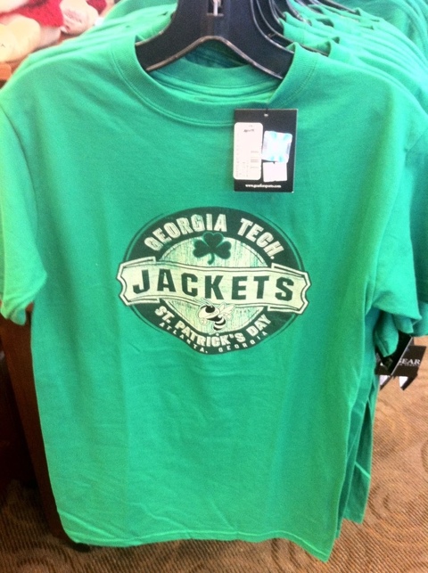
- An a nice emerald green for St. Patrick’s Day. I can almost forgive this one but… No. I can’t.
I know that Georgia Tech doesn’t print these shirts; they’re printed by third parties who pay us a pretty penny for licensing rights. We have a Trademark Management Program which claims “to protect the integrity and ensure the proper use of the Institute’s name, logos and trademarks.”
Hello… anybody home? Pink and green?
THANK YOU! THANK YOU! THANK YOU! For YEARS I have been irritated with the lack of consistency in the colors of the GT fan merchandise. This Pantone 124 that you speak of apparently ranges from pale lemon chiffon, to Cheetoh orange to Grey Poupon brown! It’s rediculous!! I get the contrasting variations with navy and black. But I don’t understand why it’s so hard to reproduce their official colors in their school merchandise and uniforms. When they play Clemson, UGA – there’s no variation in THEIR orange or red fan wear. They look united and their crowd presence makes more of an impact. GT is supposed to be a technical school. BE TECHNICAL!
Congratulations, you have stumbled onto the rule of “Women’s Colors” — i.e. the (mistaken) assumption that women will not / cannot wear such “bold”, bright colors such as black and navy blue, therefore clothing must be remade into more feminine colors such as pinks and pastels if they’re expected to be bought and worn (especially as gifts that may otherwise not be “recognized” as being acceptable gifts for girls otherwise). Red will do in a pinch too, hence the UGA-confusing shorts.
For the record, I have a brown/pink GT hoodie I picked up during freshman year, and a white / pink hoodie given to me by my sister. I also have a navy and gold GT hoodie, though, which is much more detailed than the other two.
Really, if there were just more GT-licensed apparel, PERIOD, these slights wouldn’t be such a problem.
As a marketing and branding consultant, I got a kick out of this post. You are absolutely right about the color chaos. If it’s any consolation, I’ve been making the rounds of college visits with my daughter (a high school senior) and Tech is just one of many schools that have this problem, especially with apparel. I know that doesn’t make it better, but misery loves company, right?
Joellyn — I got a semi-official (as in, sent by someone responsible, but in private email, so I can’t post it) response to this post that can be summarized as (1) we’ve always done this, and (2) everybody else is doing it, too.
To which I replied: neither of those facts makes it RIGHT.