This is a continuation of a previous set of posts and is eleventh in a series.
Yep, that’s the same slide as my last post. We haven’t finished with it yet.
I went through the first three bullets here. But the bottom half of the slide deserves a fresh post.
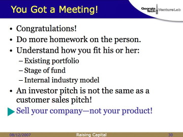
It’s probably the most common mistake I see entrepreneurs make when raising money: They come armed with a sales pitch for their product. Maybe a good pitch, maybe a bad pitch, but clearly trying to sell their product.
I don’t want to buy your product.
I might want to buy part of your company.
That’s a different proposition, and requires a different approach. Different slides. Different flow. Different questions to be answered. Just like my saying that the technology can only occupy about 10% of your business plan, the product pitch can only occupy about 10% of your fundraising presentation. (Which means a single slide if you’re following 10-20-30; more on that below.)
I know, you feel like you’re neglecting your baby. Get over it. Because, as I’ve mentioned before, you need to tell me about your team, your company history, your customers, your revenue, your competitors, your channel strategy, your potential acquirors… you know, all that stuff that might actually make me want to invest in your company! If you spend all your time on your technology, you won’t have time to tell me about the rest.
Sell your company—not your product.
Sell your company—not your product.
Sell your company—not your product.
What I tell you three times is true.
Okay, it’s time to prepare your presentation. Lord, I can’t understand why so many people screw this up.
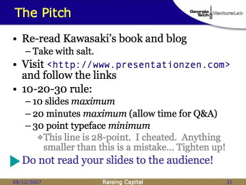
I’ve had you read Kawasaki’s book once already. Read it again. Take it with salt, since he’s primarily an entertainer, but there’s good information in there.
If you’re not a very experienced presenter—or, heck, even if you are!—go to http://www.presentationzen.com and spend an afternoon following the links and watching the examples. Buy their book. If you are a poor presenter, you can become adequate. If you already a good presenter, you can become very good. If you are Steve Jobs… well, I seriously doubt that you’re reading my blog!
Kawasaki maintains his 10-20-30 rule:
- 10 slides maximum
- 20 minutes maximum (allow time for Q&A)
- 30 point typeface minimum
You may not like these rules. You may find these rules silly. You almost certainly will find these rules very difficult to follow. Do it anyhow.
If you stuff everything into your business plan into your presentation, you will look like an idiot. (See how often that thread sneaks its way into this discussion? Don’t look like an idiot.) Heck, if you simply stuff everything in your executive summary into your presentation, you’re still just average.
In your fundraising presentation, you are selling. You’re selling the company, not the product (see above), but it’s a sales pitch nonetheless. Treat it that way.
(Refusal to see the presentation as a sales pitch, incidentally, leads to thinking you have to create a presentation that stands on its own. This is the prime cause for the “kitchen sink” syndrome of throwing everything into the PowerPoint/Keynote file. FAIL. If you don’t remember why “your PowerPoint deck shouldn’t function without you standing in front of it talking,” then go re-read Part 08.)
Now, this is where I shout at students.
When I say 30-point type, I mean 30-point type. Or bigger.
I used to say “Your text should be legible if you have 35mm slides and you’re reviewing them on a light table. Without a loupe.” But the young whippersnappers are beginning to stop laughing at me and start looking at me with a puzzled look of non-comprehension. It’s like I’m talking about cuneiform or something. Sigh.
So then I started saying “Your slides should be legible on a cellphone screen.” But then everybody started getting iPhones with as many pixels as my original Mac, so that doesn’t work anymore.
So now I’ll stick with the 30-point rule. Or, if you’re mathematically inclined, then let me modify Kawasaki’s algorithm: “Find out the age of the oldest person in your audience and divide it by 1.5. That’s your optimal font size.”
You think you have a good reason to break that rule. You have more information than you can convey in type that big. Or you have a data chart that really needs 12-point labels. Or you’re pasting in a spreadsheet using OLE (data exchange of the devil) and it’s really hard to reformat it. Or you’re reusing old slides and don’t have time to create new ones.
All of these are weak excuses that make you look lazy, or stupid, or both.
Get it in gear and create new slides (channelling both Tufte and Kawasaki, with a nice dollop of Presentation Zen) that provide a good backdrop for you to stand in front of while selling the company. Because the important part of that presentation is you. If you’re shovelling too much information into the slides, you’re embellishing the backdrop, while what you need to be focusing on is yourself and the message you convey.
Slides can’t do that for you. The slideshow should be a set of reminders for you of what points to hit, in which order, as well as some pretty diagrams or photographs for concepts that deserve them. In fact, once you get good at this, you can reduce your entire presentation to diagrams and photographs, with no words at all.
And then you won’t care about type size, because you won’t be using any.
(Let me digress here: there is no reason whatsoever to use 90% of the animation options available in PowerPoint or Keynote. In particular, if you use “Laser Type” or “Typewriter” in front of me, I will do my best to accidentally knock your laptop to the floor.)
Presentation style: You should plan to speak at a measured pace of about 100 words per minute. Most people read at about 400 words per minute; I manage about 1200. (And, in the world of VCs where everyone scored 1600 on their SATs, I’m only about average.) So if you stand there and read what’s on your slides to me, I’m going to finish reading the entire page while you’re still on your first bullet. Boredom sets in…
In the best case, I’ll pull out my Treo and start reading email. At least that’s a visible signal that you need to do something to take control of the meeting. In the worst cases, I start thinking about other deals I’m involved in… or other deals I want to do… or why no one wants to buy my Panoz… or whatever. And you’ll never know that I’m tuning out 11/12ths of what you say.
Again, the slides should be a backdrop. You should tell a compelling story in front of them that makes me pay attention to you, not the screen. In other words, don’t be this guy.
One way to tell
if you’re focusing the attention on yourself is to videotape yourself giving your presentation. This is painful. You’ll hate the way you hum and haw, the way your mannerisms are magnified, the way you lean on the presentation as a crutch. Okay. Then do it again. And again. You will get better.
Finally, here’s a gedankenexperiment for you: If you walk into the VCs conference room for your scheduled meeting and there is a complete power failure, what are you going to do? (For the smart-asses among you: Assume the conference room is well-lit by windows, and that your laptop battery is dead.) Miss the opportunity? Or pitch without your PowerPoint crutch?