I don’t envy the print publications. First Web browsers, now iPads… new technology is destabilizing the very underpinnings of their business models.
But some are adapting better than others.
Here’s a good way not to design a home page, from my friends at the Atlanta Business Chronicle. (Who, by the way, do a bang-up job of reporting the news in Atlanta’s business community. Their corporate policies just make it impossible to find their work.)
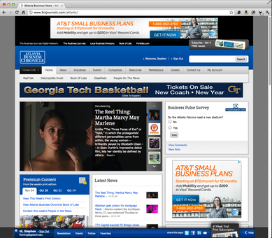
First, today’s home page:
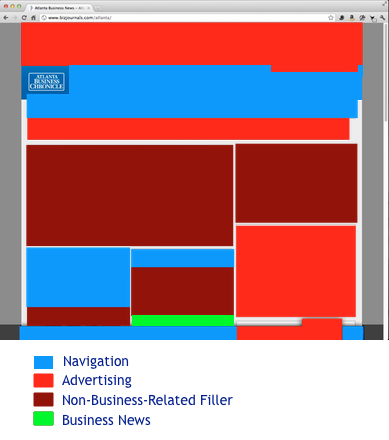
Just for curiosity’s sake, I color-coded the page to show navigation (some of which is a necessary evil), advertising, and non-business-related filler material.
The one news item visible on my 1920×1280 screen is half a headline; the bottom half is obscured.
My content window is 1165×962 pixels. Measuring generously, 284×22 are devoted to news. That’s half a percent for content, 99.5% other stuff.


Not a very indepth study, eh?
It’s funny, I actually thought that it was a website for Georgia Tech Basketball
Nice post, man. I actually did a very similar post with my school’s athletic page a few weeks ago: http://cnnr.me/b/2011/09/comments-on-the-new-slu-billikens-site/
Thought I’d just throw that your way. Nice post again!
Hey Stephen, thanks for keeping us honest! I replied over at Hacker News:
http://news.ycombinator.com/item?id=3197930
You’re assuming their goal is to present thoughtfully-written business news you. It’s not. Their goal is to sell advertising. They want you to see and click as many ads as possible. Just as grocery stores always put the milk in the back of the store, with the current revenue model, the business news (and other high-quality, expensive to make content) will always be hidden.
What is it about news sites in particular that make them suck at design? Nearly all of them seem to have a layout fixed at a few hundred pixels wide, consisting of a column of ads, one thin column of actual news (interspersed with ads), and two more columns of ads, at least one of which trails on for a mile beyond the end of the rest of the page.
I wouldn’t go to that website for business news. Weird, since it’s called the Atlanta *Business* Chronicle.
Nice post.
Selling advertising is their business; news is merely the bait. That’s why articles are finished somewhere in the middle of the paper or additional web pages instead of beneath the fold. Reuters.com is my favorite news site for content, design, and limited or segregated commentary.
Reminds me of Norton Disk Doctor defragmenting a hard drive in Mac OS 9.